From a young age, I was aware of typefaces. Only I didn’t know they were typefaces as I was five, and although fairly bright and a precocious reader, I wasn’t some kind of intellectual-design-kid-prodigy (although how cool would one of those be?!). I remember wondering why certain ‘types’ of letters were used for kids books, adults books, cereal boxes, billboards, TV adverts etc. and noticing patterns as to how they were used, the styles that were aimed at kids on toys and cartoons for example. Then as an egotistical and slightly obnoxious teenager I spent inordinate amounts of time developing (far too) many variations on how I wrote and signed my name (Mandi, with an ‘i’ of course – cringe) and then painstakingly scrawled it all over my – and my pals’ – schoolbooks.
Safe to say, I find the subject of typography fascinating, and can look at type books for hours; probably longer than would be considered healthy. I obsess about it because as a designer, its an important part of my job; weird typesetting and crazy typeface choices can do so much damage to visual harmony, brand voice, legibility, readability and ultimately the viewer’s understanding of a piece of communication.
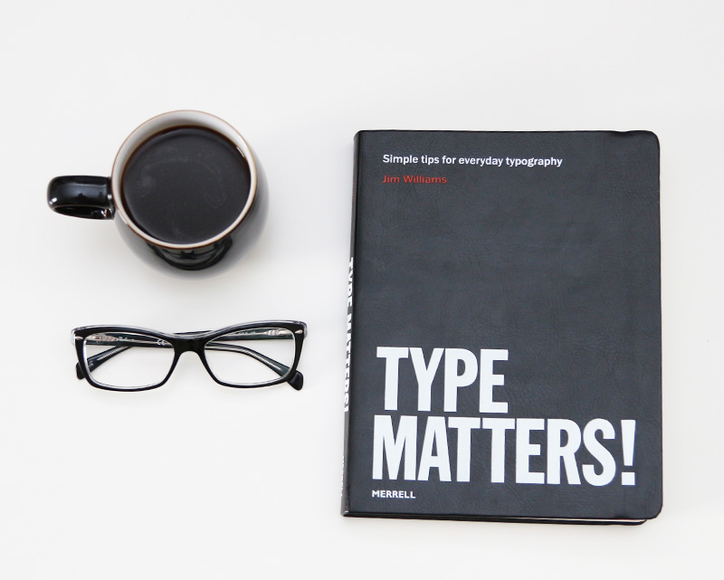
Anyway this brings me to this excellent book, Type Matters! by Jim Williams. This is a great book for a basic, but comprehensive, education in typesetting. An absolute pleasure to read with a gorgeously tactile cover, rounded page edges and beautiful typographic spread.
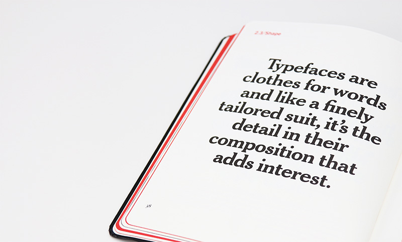
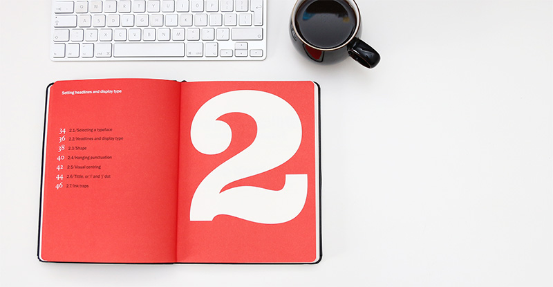
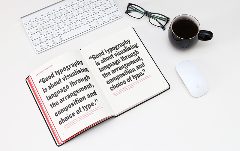
Type Matters! covers a huge range of topics, with each being illustrated with clear examples. I devoured this book in no time at all. To be honest much of it I was taught at college, but it’s always good to refresh your memory I say. This is a fabulous book for design students, and also a handy reference tool for seasoned designers too. Plus it looks great on your bookshelf…