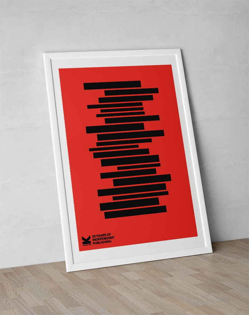
The brief for this project required a poster to celebrate the 20 year anniversary of the creative publishing company Laurence King, that was themed around the number 20. I chose to design a minimal, graphic poster containing 20 books and based on a 20 row grid. I measured an assortment of Laurence King books to get the book spine proportions then set them against the grid. The tower of books represents growth of knowledge, ideas and creativity that Laurence King books offer and also the growth of the publishing house since its beginnings in 1991. The red and black reference the brand colours and are also a nod to some of my favourite LK books.
- Brand Application
- Illustration
- Minimalist Conceptual Design
