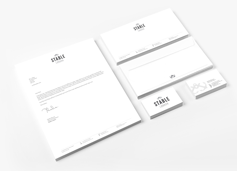
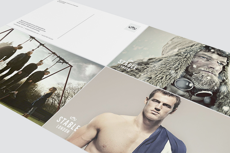
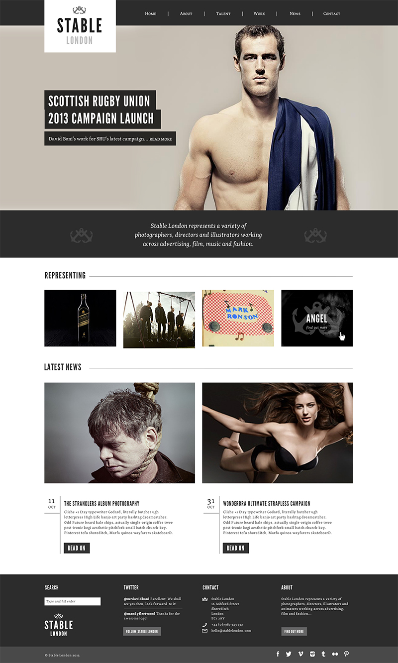
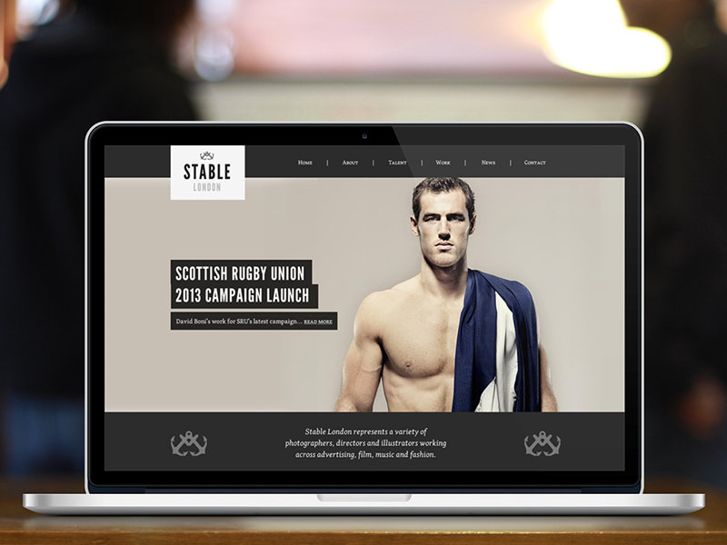
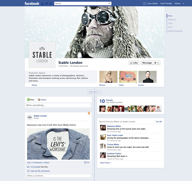
Stable London is a hybrid of a production company and photographers agency for integrated artists in photography, film and animation covering (but not limited to) advertising and music video. They required a visual identity that conveyed the definition of the word stable – strong and balanced – whilst also retaining a contemporary, high end feel to compliment the calibre of work that the agency represents.
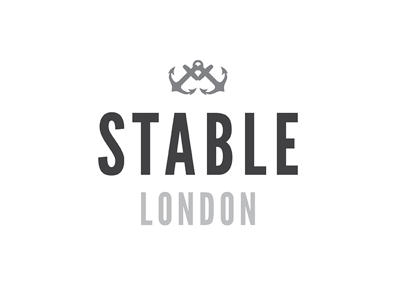
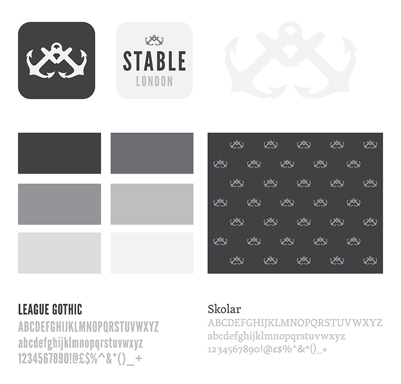
A logo with bold, confident typography and emphasis on the word Stable was teamed with a pair of anchors, to add visual interest and convey stability, after all two anchors is pretty steadfast. A colour palette of shades of grey were used to complement the visually led website and not compete with the work featured; to allow the brand to sit back and lets the work be the focus.
A fast paced project that was excellent fun to work on.
- Brand Development
- Digital Art Direction
- Logo Design
- Promotional Material
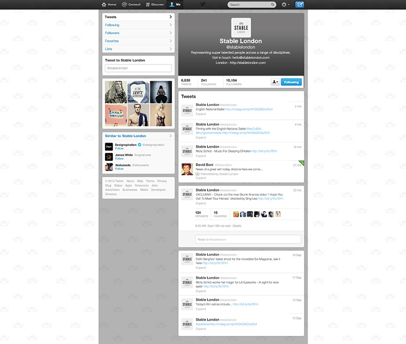
- Social Media
- Web Typography
